Originally published on Progress and Poverty on January 13, 2026. Republished on Progress.org with permission.

The contents of this essay, including all data, analyses, and predictions regarding the 18-year real estate cycle, are provided for informational and educational purposes only. This document does not constitute financial, investment, legal, or tax advice. The views expressed are the author’s personal reflections on economic theory and should not be interpreted as a recommendation to buy, sell, or hold any specific security or to adopt any particular investment strategy. The author is not a licensed financial advisor, registered investment advisor, or certified financial planner. Any investment decisions made based on the information in this post are at your own risk. You have been warned.
Henry George argued that land speculation plays a significant role in economic cycles, and that land value taxation could dampen cycles by deterring such speculation. Some Georgists have argued that not only does real estate speculation contribute to bubbles, but it does so on a fairly regular – and predictable – pattern. Specifically, they say that land cycles generate significant crashes approximately every 18 years. While this theory flies in the face of conventional modern portfolio theory, its advocates are credited with having called both the early 1990s recession as well as the Great Recession of 2008, many years in advance.
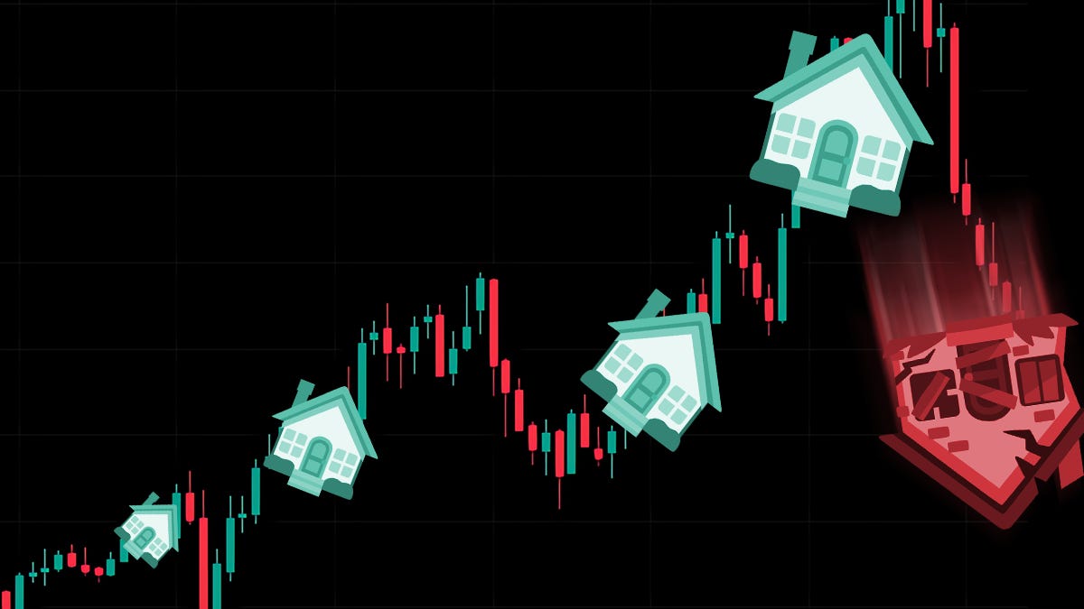
The next crash is predicted to occur this year, in 2026, giving new reasons to take a closer look at this theory.
The essay is divided into three main parts. First, I summarize the theory and its origins. Second, I look at the evidence for it. Finally, I conclude with the theory’s implications for individuals and the Georgist movement alike.
The 18 Year Cycle Theory
The land cycle theory, first developed by Henry George, is based on the insight that the supply of land is completely inelastic – we cannot produce any more of it in response to rising demand. Consequently, the market in land behaves differently from markets in other commodities. When demand for a non-land good increases, it motivates producers to provide more of the good, expanding supply while pushing long-term prices towards the good’s production cost. However, since land is not created, it has no production cost. Therefore, when demand for land increases, there is no corresponding expansion of its supply. Instead, its price inflates. This means that land values tend to absorb the value of increasing productivity. This is most clear with local public goods. The opening of a new metro station in an area will greatly increase local real estate prices. But rising land values can also come from general growth and increasing purchasing power, which increases demand for land.
This all makes land markets unusually susceptible to speculation. How much I am willing to pay for a site will largely depend on how much I expect to be able to sell it for later. I will pay more for an asset if I expect its resale value to rise than if I expect this value to fall. Thereby, increasing land prices creates expectations for future increases, which further increase the price, creating a self-fulfilling prophecy.
This has adverse effects on the broader economy, since land is itself an input into production and a good that we must all consume in the form of our homes. Hence, increasing land prices have the side effect of raising the costs of production and cost of living. This “private tax” on the economy ensures that the bubble cannot continue indefinitely. At some point, land speculators will be unable to find buyers at current prices, at which point the bubble bursts and the market crashes. Since land is often used as collateral for loans, and since land values tend to absorb the wider economic productivity, these effects ripple out across the economy as a whole. Then, as land prices fall to reflect their non-speculative rental value, producers and regular people can again afford land, at which point production resumes, and the cycle starts anew.
The 18-year pattern in real estate values was first discovered by urban economist Homer Hoyt. After losing significant investments in real estate during the Great Depression, he focused his dissertation, One Hundred Years of Land Values in Chicago, which explores the history of land values in Chicago, noting a remarkably consistent 18-year pattern. The thesis remains widely read and cited today. Fred Harrison built on this with his 1983 book The Power in the Land, by integrating the Georgist land cycle theory with Hoyt’s empirical pattern. Harrison applied the model prospectively, predicting that the next peak in land values would occur around 1990, followed by a recession.
Harrison and other defenders of the model argue that the cycle follows a larger and highly specific pattern, illustrated in the image below. In this supposed pattern, a crash is followed by a ~4-year recession phase, a ~7-year buildup phase ending with a “mid-cycle dip”, followed by another ~7-year boom, finally concluding with a bust. After this, the cycle repeats.

So why would this specific pattern emerge? While the Georgist theory explains why cycles arise in the land market, it does not necessarily imply that these cycles should always be the same length, nor that their length should be around 18 years in particular.
Harrison argues that this pattern emerges due to specific features of land and real estate markets. Drawing upon historical data, he argues that there is an approximately 14-year building cycle for real estate. One historical reason for this was the 5% interest rate, set by English usury laws, giving a predictable length for real estate developers to pay off their mortgages. These 14-year periods correspond to the “expansion” phase in the cycle. This expansion phase is not smooth, but is divided into two roughly similarly sized parts: a “recovery” phase and an “explosive” phase. These two phases are separated by a “mid-cycle recession”. The reason for the approximate seven-year phases is, again, a pattern in the housing market, as this corresponds to the average life of a mortgage.
The second seven-year phase generates increasing returns and increasingly aggressive investing, escalating to the final boom, or “winner’s curse” phase. In this phase, market prices are set only by those providing the highest bids for an asset, entailing that market prices will be determined by those most prone to overestimating the value of the asset. Eventually, these optimistic speculators find that no one is willing to purchase their investments, at which point the bubble bursts, causing a recession, which lasts for approximately 4 years. This length of the period was also estimated by Keynes, and is determined by a mix of human psychology and the durability of capital rendered redundant during the post-boom phase. After this 3-5 year period, confidence increases, leading to the initiation of new construction and the start of a new cycle.
Using this theory, Harrison extrapolated into the future from the 1973 crisis, accurately predicting both the early 1990s recession and the Great Recession of 2008. The mid-cycle dips, which the theory places approximately 7 years prior to the big bust, correspond to the dotcom bust of 2001 and the Coronavirus downturn of 2020. The next big crash is predicted for 2026.
What does the evidence say?
I have tried to assess this theory with several different types of evidence. First, we must ask what the ‘base rate’ of the claim is. In other words, what type of claim is this, and how often do these types of claims tend to be true? Secondly, we look at the historical data supposedly justifying the 18-year pattern. Can we be sure the pattern is a genuine signal, instead of just random noise? Finally, if we were indeed on the verge of a crisis, shouldn’t there already be signs of this? What signs would we expect, and can we detect them already?
Base rate and prior probability
A great place to start is to ask how often theories and forecasters trying to beat the market are correct. In my view, this provides the strongest argument against the theory. According to modern portfolio theory, people cannot reliably time the market with their investments, and doing so generally leads to lower returns due to missing investment opportunities. Similarly, pundits and ‘experts’ giving investment advice generally have a very poor track record. Indeed, some evidence suggests that these supposed experts do worse than chance. Thus, on the standard view, economic downturns are unpredictable and based on idiosyncratic factors that vary from one occasion to the next.
Furthermore, there is good reason to consider this consensus view as well-supported. Given the huge sums invested in this field, the economic returns to anyone capable of precisely predicting downturns would be massive. Therefore, if the pattern was as simple as the crisis occurring approximately every 18 years, it should have been obvious to more observers. Hence, we should take any voice significantly deviating from this consensus with a fistful of salt, and have very low starting priors for such advice being correct.
There is an old joke about two economists walking down the street, as one of them spots a $100 bill. However, his friends say that there is no need to pick it up. If it were a real $100 bill, it would have been picked up by someone else a long time ago! While the joke is intended to make fun of an over-reliance on the efficient market hypothesis, I think that the analogy does provide some weight in this example. If the 18-year cycle is true and reliable enough to use for market prediction, we are talking about a trillion-dollar bill on the street. Moreover, this is an extremely busy street, trafficked by millions of people vigorously looking for lost bills. If the theory is correct, this bill has been lying openly on the street for decades. This justifies a high degree of initial skepticism.
Historical pattern and theoretical coherence
The evidence used to support the 18-year cycles is primarily based on macroeconomic data tracking land value cycles and economic crashes. Consider this table, showing the peaks and intervals of land values and business cycles over the last 200 years:
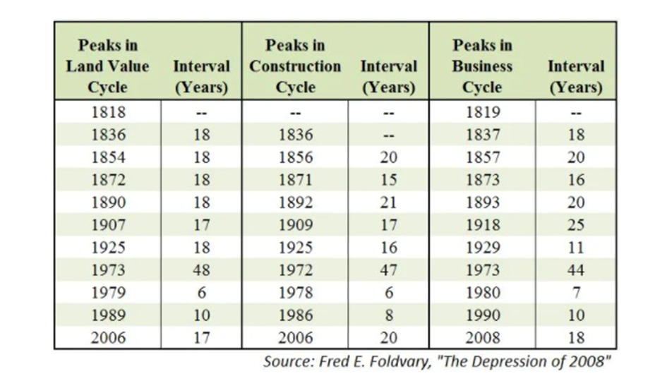
A few things stand out. The interval pattern in land values before 1925 is surprisingly persistent, being only off by one year in six cycles. However, there are disruptions. How problematic these deviations are will largely depend upon how much we need to adapt the model to account for them, or in other words, how many ‘degrees of freedom’ we accept. Can these deviations be accounted for in a way that is theoretically justifiable, or is it ad hoc? I will try to give an interpretation in line with what defenders of the theory could say. Treat the following arguments as trying to “steelman” the pattern, rather than decisively disregarding contrary evidence. These deviations undermine the elegance of the pattern, and even if the theory can account for interruptions, excessive degrees of freedom risk making the theory unfalsifiable.
One such issue is that the pattern since 1973 is a bit erratic, with 6, 10, and 17-year intervals. One possible interpretation is to understand the 1979 peak as just a strong mid-cycle dip, rendering the period 1973-1989 into a single 16-year cycle, closer in line with the pattern. This is the approach Harrison took in 1983, using the 1973 peak as the baseline from which he anticipated a new 18-year cycle. Defenders of this interpretation could argue that it is theoretically motivated, due to their recognition of mid-cycle dips, but skeptics would still worry about this as a way to retrofit the data to fit the theory.
The bigger issue is the half-century gap from 1925 to 1973. Defenders of the view attribute this anomaly to the two world wars and the post-war rebuilding phase. Another speculative explanation, more in line with Georgist theory, is the significant shifts in land use during this period. Widespread adoption of the car enabled suburban sprawl into cheap land, while the invention of the elevator massively increased how intensely land could be used. Together, these opened up a “new frontier”, mitigating and postponing many of the difficulties Georgists saw in the land market.
When we shift focus from the land value cycles to the business cycle, the pattern is much more erratic. While there is still an average of around 18-years, the variation is much higher. These deviations from the pattern tell us that busts do not always arrive with clockwork precision. However, let us look at the matches between land value peaks and crashes – almost all land value peaks were followed by a crash within a 3-year window. The most notable deviation from the pattern was the 1907 land value peak, which would make us expect a crash near the end of that decade. Instead, it is listed as corresponding to a 1918 crash, rendering the interval before it unusually long and the interval after it unusually short.
One possible explanation for this would again be World War I. But this can’t be the full story, since the war did not begin until 1914. Mason Gaffney offers another interesting theory: “From 1798 to 1929 the 18-year cycle of land booms and crashes was broken only once, in 1911, 18 years after the crash of 1893. What went right then? That was the only time before or after when the nation’s treasuries depended mainly on the property tax, and there was no big runup of land values” (Gaffney 2013, p. 156). This explanation has a lot of theoretical elegance, and if we accept it, it would lend credence not only to the crash pattern but also to the Georgist policy proposal to contain them. But again, we should always be a bit skeptical about retrofitting.
How persuasive we find the pattern largely depends on whether we find these adjustments theoretically justified. To give a broad sense, by removing the outlying 1925-1973 gap and merging the 1973-1989 period into one interval, the standard deviation of the land value intervals falls from 11.4 to 0.5 years, while the coefficient of variation falls from 60% to 3%. While the former set shows no meaningful signal at all, the latter shows a really strong pattern. Yet, unless we feel strongly justified about these modeling choices, this clearly looks like massaging the data.
The fact that we only have about 10 observations prevents us from doing formal statistical inferences or stronger hypothesis testing. And since these observations are collected over such long periods, a lot of the economic institutions and background conditions are bound to change. However, this limitation is inherent to the kind of long cycles proposed by the theory itself. To get 100 observations, we would need to collect data for another 1600 years, which is not really helpful if we want to know what the theory can tell us in 2026. Therefore, it seems that we are currently bound to plausibility assessments, rather than stringent hypothesis testing.
Moreover, I think that one word of warning should be considered in relation to the table. My impression is that it is intended to illustrate the supposed cycle by listing all crashes that can be connected to nearby peaks in land values. However, it is not a comprehensive list of all crashes during this period. I don’t think that Foldvary should be accused of cherry-picking data, because he could have easily listed the crash of 1948 if he had wanted to, which came 19-years after the Great Depression. However, if we accept that crashes occur regularly, there is a non-trivial chance that any land value peak will coincide with such a crash by chance. Some of these other crashes might be explained by the cycle model as mid-cycle dips, but overall, it should make us more cautious in interpreting the results.
I would appreciate someone better trained in economic history and statistical modeling than I am to take a crack at this, with more sophisticated analysis and a larger dataset. Ideally, I’d like to see the theory applied to data sets that it was not itself trained on, but as suggested above, that might be methodologically tricky. Due to increasing global economic integration, it seems feasible that global economic rhythms would be increasingly synchronized.
This connects with the worry of this pattern arising from mere data mining from a large dataset. Some patterns are bound to emerge randomly, so what should make us trust this one? I think that there is some value arising from the fact that the two latest observations postdate Harrison’s 1983 claim that these cycles are not only historical, but also ongoing. He is often credited with anticipating both the 1990 and 2008 peaks, extrapolating from this pattern. If we assume that there is a 15% chance of calling a peak in advance, that gives you only a ~2% chance of being correct twice in a row. Notice that any such numbers should not be taken too literally, and are supposed to be illustrative rather than definitive. Since these predictions are fuzzy, whether a prediction qualifies as successful is not always clear-cut, and if we expand our criteria for what qualifies as a successful prediction, we also risk including more random noise.
Another approach to assessing the risk of data mining is to ask to what extent the mechanism can be plausibly explained. I have a high credence in the Georgist economic theory generally, including the Georgist business cycle theory more specifically. This theory provides some reason to believe that cycles would be fairly predictable and suggests that they arise due to structural features of the economy, rather than random external shocks. However, as mentioned above, this theory in itself does not imply that cycles must be of any particular length.
I find the suggested explanation for the 18-year land cycle theory, and the data concerning the particulars of the housing market, rather opaque and difficult to assess. Harrison does go through different forms of historical evidence, such as the time-scales used by homeowners’ building societies, historical interest rates, and historical data mapping cycles of building. However, the outcome feels a bit contingent. The claim that building cycles tend to be about 7, or 14 years, or that recessions usually follow a 4-year pattern sounds more like rules of thumb than laws of nature. It sounds similar to the conventional wisdom in construction that houses have an approximate life-cycle of 50 years, before every piece will need some repair or replacement. These figures could turn out to be right, but I do not feel compelled by the evidence in the same way that I find the more general Georgist cycle theory compelling.
Crisis tendencies?
Another type of evidence that could either support or undermine the theory is to ask what signs would be observable today if we were indeed in the boom-phase of a cycle. If these signs are observable, this would lend more credence to the theory that we are approaching a crash. Hence, I tried to spot-check some key metrics. To avoid cherry-picking metrics that fit my priors, I asked AI to suggest a number of key housing-market indicators that would likely show signs under a land bubble, and then I independently checked this data.
- Price-to-Rent Ratio: The purchasing price of land is basically a capitalization of the expected revenue, including both its actual rental value plus speculative expectations. In the boom phase of a cycle, we would expect such speculation to increase, inflating housing prices beyond the rental value that they actually generate, thereby also increasing the price-to-rent ratio. Over the last few decades, this metric has hovered around 100, before shooting up to an all-time high of ca. 135 since 2022, exceeding the previous 2006 peak at 127.
- Land Value to GDP: The main driver of the cycle is that speculation of land prices inflates this sector relative to the rest of the economy, to an unsustainable level. Hence, if we are indeed in the boom phase, we would expect these metrics to be elevated compared to normal levels. At about 14%, the share of real estate and leasing of GDP is elevated and close to an all-time high (at least for the period I could find data for).
- Household debt: The theory suggests that credit would become dangerously loose as we approach the final, speculative stage of the bubble. While household debt is at a nominal all-time high of ca $18.6 trillion, a proper assessment would also need to consider inflation and income growth. Household debt as a share of personal income does not seem unusually elevated. Moreover, while the 2008 crisis was triggered by subprime mortgage loans, this does not seem like an imminent threat today, as about 90% of mortgages are locked into low fixed-term rates. A skeptic could interpret this as evidence against a looming real estate crash. A proponent would rather say that it is likely to change the trigger mechanism of the crash, for example, saying that it would be more likely expressed through a frozen market, or that it is more likely to occur in the commercial real estate sector. Nevertheless, this introduces some measure of protection for many current homeowners, who are much less vulnerable to default than during the previous cycle.
- Housing supply: During the boom phase, access to cheap credit and high expectations encourages construction of new housing. However, since such construction takes time, there is often a significant lag between the decision to build and the actual increase in supply. Moreover, the increasing prices that incentivize such building also price people out of the market, meaning that actual demand does not meet this new supply, causing an excess inventory. The Monthly Supply of New Houses (MSACRS) measures such inventory of new houses. Since 2022, it has hovered around 7-10, significantly above the historical average, ranging around 5 to 6.
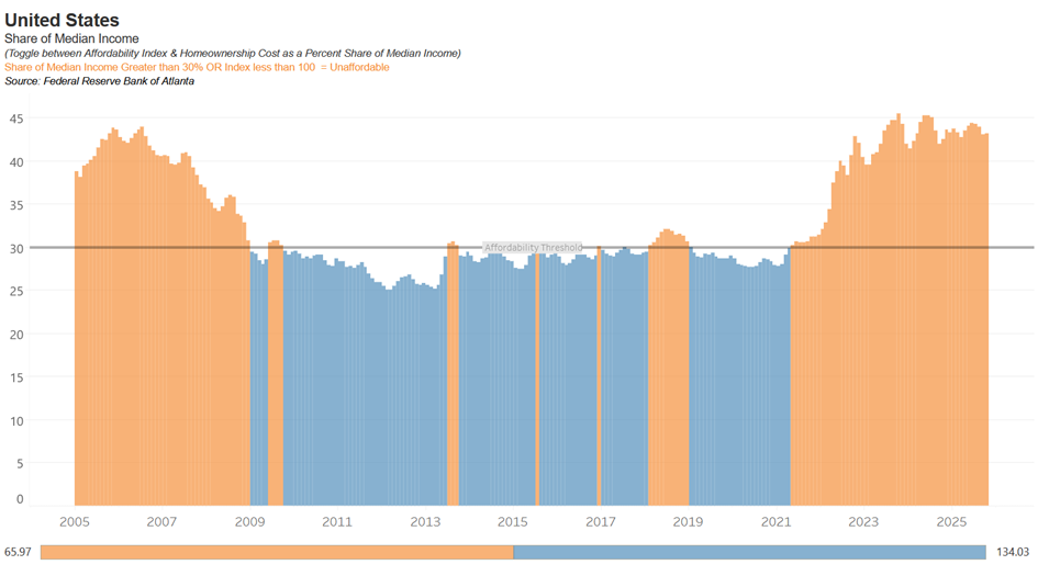
- Housing Affordability: Since the theory suggests that a driving cause of the bust is that land prices exceed people’s ability to pay, the theory would predict a trend towards falling housing affordability in the years leading up to a crash. The evidence I found suggests that this is indeed the case. Data from FRED’s Housing Affordability Index relates the median household’s income to the median housing costs. A score of 100 means that the median household can just barely afford mortgages, while a higher score means that they can afford it by some margin, and a score that is lower means that they cannot afford it. From 2018 to today, the index has fallen from about 150 to 100. A similar story can be seen in the FED’s data on homeownership costs as a percent share of median income, displayed below. As you can see, it shows a clear peak before the 2006 crash, followed by 15 years of relative affordability, before a sharp increase since 2021. See, for example, this graph:
Four out of five of the metrics align directionally with the predictions made from the theory about what kind of signs we would expect to see prior to a crash, while one is more ambiguous. Of course, these results could be a fluke, independent of any pattern. The relevant question to ask is how likely these results would have occurred if the 18-year theory is correct, compared with the probability that they occur as a fluke, and update our credence in the theories accordingly. By these lights, I think that this provides some interesting evidence in support of the theory.
Adding to this, here is an excerpt from a recent report from the forecasting institute Sentinel.
The US economy is displaying a number of indicators of distress.
In housing, the number of homes on the market greatly exceeds the number of buyers, and there are signs that homeowners are under financial pressure: for instance, the number of Google searches for “help with mortgage” has passed its 2008 peak (as we reported previously), and US Google searches for “bankruptcy lawyer” recently reached an all-time high. The commercial real estate market is also struggling with vacancies.
Nonetheless, the housing market is also in a very different place than in 2008; the market isn’t plagued by adjustable-rate mortgages (more than 90% of US mortgages are fixed-rate loans), and homeowners own a large and growing share of the equity in their homes. […]
The University of Michigan’s Consumer Sentiment Index is near historic lows. The labor market has been weakening. Meanwhile, the S&P 500 chases all-time highs, powered by AI investments, even as bond markets are signaling risks.
Forecasters estimate a 19% (14% to 30%) probability that the SP 500 will drop more than 10% in any one week by the end of 2026. They point out that the baserate is six times since 1980 (this list, plus COVID and the 2025 crash). They also point to the Case-Shiller index, a measure of housing valuations, being at all-time highs, suggesting that it has peaked, although a fall might not be precipitous.
Notice that a lot of these contemporary trends could also be explained by alternative hypotheses, such as the worry about an AI bubble. Whether the AI sector is a bubble is an entire genre of Substack posts in itself, and I will not weigh in on it here. However, notice that this theory is not necessarily mutually exclusive with the 18-year theory and could even be interpreted as complementary. Since there is bleedover between different asset types, the bubbles and crashes predicted by the 18-year theory are not necessarily restricted to the housing sector. Soaring housing costs will enable homeowners and landlords to invest more aggressively in the stock market, while ballooning stock prices will also increase people’s purchasing power for buying real estate. For example, this is how advocates of the theory would connect the dotcom bubble with the land cycle. This also means that a crash in one of these sectors would affect the other, such that a housing crash could pop a potential AI bubble, or vice versa.
Conclusion
Taken together, these various types of evidence paint an interesting but inconclusive picture. When assessing the evidence, I think that it is important to distinguish between at least three levels of claims:
- That land plays an important structural role in creating business cycles,
- That these cycles are a fairly regular pattern, averaging around 18 years, and
- That this pattern is sufficiently predictable for us to use when making investment decisions.
We should clearly have more credence in (1) than (2), and (2) than (3). To support the Georgist claim that LVT is desirable, due to its ability to dampen speculative cycles (among other reasons), we only need to accept (1). However, if we want to use this for private investment decisions, the relevant factor is your credence in (3).
I do find the empirical pattern in the land value cycle noteworthy, but would like to have a better understanding of why this pattern emerges. I also find it plausible, both theoretically and based on the data, that these land value peaks would cause, or coincide with, business cycle downturns. However, the exact relationship between them seems very fuzzy, with significant deviations. I am not sure if this is a damning problem for the model on a theoretical level. It seems plausible that land-value peaks create heightened economic vulnerability, which only erupts into a crash when combined with some further trigger. And such triggers may well occur semi-randomly.
But even if we find such a model plausible, it significantly undermines the confidence I would need to use this for exact forecasting. While the spot-checking of the housing market directionally aligns with the predictions of the theory, suggesting that there is a heightened period of vulnerability, I also take the warnings against trying to time the market very seriously. One of the strongest arguments against the theory is the low base rate that we can successfully predict the market. And this issue seems to directly challenge statement (3), but not really undermine (1) or (2). To quote Startup L. Jackson: “Predicting what’s going to happen is often pretty easy. How is harder. But when, when is the one that ******* kills ya”.
When assessing theories like this, we should think in probabilistic rather than binary terms. The relevant question is not whether it is definitely true or false, but how likely it is. Moreover, the level of credence that matters depends on the context in which we are using it. An investor does not need to assign a probability above 50% for a hypothesis to affect their decisions. Only a probability high enough to change which option has the highest expected value. Because the outcomes of a potential crash would be highly asymmetric, even a relatively low probability may still warrant taking the theory seriously. When betting on the future, we should not only consider the probabilities but also the odds. I am not offering investment advice, but I think that this approach is intellectually valuable, giving us actual skin in the game when assessing these theories, and prompts us to think in degrees of belief rather than simple binaries.
Using this probabilistic approach also makes it easier to change our minds in response to new arguments. I remain uncertain and could make significant updates in light of new evidence. On the positive side, whatever happens in the coming year, it will provide another useful data point. I also hope that the essay will prompt discussion that can help me get a better grasp. I am sure that some parts of the reasoning above are mistaken, but in the spirit of Cunningham’s law, the best way to find out which parts is to share this essay.
I find the 18-year theory interesting, but it is not the main foundation for my confidence in Georgism. Hence, even if the 18-year theory turns out to be incorrect, I will not take this as a fundamental issue for Georgism more broadly. Nevertheless, I believe that a 2026 crash could have important implications for the Georgist movement. Periods of crisis often increase the possibility of social reform. To quote Friedman: “Only a crisis – actual or perceived – produces real change”. The Great Depression was a significant catalyst for Keynesianism, whereas the stagflation of the 1970s lifted neoliberal and monetarist policies from the academic seminar room to state policy. Georgism provides both a diagnosis and a treatment for cycles, since taxation of land values would reduce the incentive to speculate on land values, thereby removing a structural cause for such cycles. If Georgists successfully predict another downturn, this could bring additional attention to the view. Hence, if the theory is correct, this can become a crucial opportunity for the Georgist movement to advance our solutions to social problems. We should be prepared to seize it.
Further Reading
Here is some literature discussing or defending the view. Note that I do not necessarily endorse the reasoning or conclusions of these texts, and I have not read everything on this list. For people new to the subject, my primary recommendation would be to check out the two texts by Fred Foldvary.
- Anderson, Phillip J. 2009. The Secret Life of Real Estate and Banking. London: Shepheard-Walwyn.
- Bird, Mike. (2025). The Land Trap: A New History of the World’s Oldest Asset. New York: Portfolio.
A recent treatment of the financialization of land with clear parallels to the Georgist land cycle theory. See also this excellent book review, published on the Progree & Poverty Substack! - Foldvary, Fred E. 1997. “The Business Cycle.: A Georgist-Austrian Synthesis.” American Journal of Economics and Sociology 56(4): 521–24. doi:10.1111/j.1536-7150.1997.tb02657.x.
Journal article in which Foldvary seeks to reconcile Georgist and Austrian cycle theory, notably predicting the 2008 crisis. - Foldvary, Fred E. 2007. “The Depression of 2008.” doi:10.2139/ssrn.1103584.
- George, Henry. 1898 [1879]. Progress and Poverty: An Inquiry Into the Cause of Industrial Depressions and of Increase of Want With Increase of Wealth: The Remedy. New York: Doubleday and McClure Company.
The core statement of Georgist theory. For a discussion of the Georgist business cycle theory, see book V, chapter I.
If 19th-century English is not for you, I recommend this 2006 version, edited and abridged for modern readers by Bob Drake. - Harrison, Fred. 1983. The Power in the Land. London: Shepheard-Walwyn Publ.
- Harrison, Fred. 2005. Boom Bust: House Prices, Banking and the Depression of 2010. London: Shepheard-Walwyn.
- Harrison, Fred. 2021. #WeAreRent, Book 1: Capitalism, Cannibalism and Why We Must Outlaw Free Riding. Teddington, London: Land Research Trust.
Harrison’s most recent two-volume book, in which he predicts a 2026 house-price peak followed by a recession. - Hoyt, Homer. 1933. One Hundred Years of Land Values in Chicago: The Relationship of the Growth of Chicago to the Rise in Its Land Values, 1830-1933. Chicago: University of Chicago Press.
- “The Eighteen-Year Real Estate Cycle.” 2012. Georgist Journal.
Interesting excerpts from an email exchange of well-known Georgists discussing these ideas.